Let me call to your attention two excellent maps that in my humble opinion should make sweet cartographic love and spawn a mashup of some sort. This confluence of maps, blogs and public transportation has got the limeduck quacking loudly.
First up, Boston Blogs’ map of Boston blog by T stop.
Still in beta, this excellent map is simply the MBTA’s official subway (and Silver line) map with a link at each station to blogs tagged with that T stop. It looks like Davis square is the belle of the ball with 25 blogs as of this writing, and my own dear Central has a respectable showing at 15 blogs. The Red line is not surprisingly the bloggiest MBTA line.
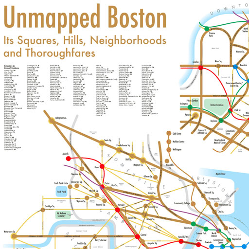
My second nominee is Unmapped Boston from Unmapped Cities.
This is a completely new view of the Boston area. It combines major streets, subway routes, and most importantly, a pretty comprehensive list of the squares that define Boston neighborhoods, all while remaining substantially but not literally true to geography. The map is available on paper ($20, get one today, I just did!) and is a beautiful work of design.
Here’s my immodest proposal: Unmapped Boston should hook up with Boston Blogs to create a cartographic listing of Boston area blogs by square, and not just the squares that have T stops. Sure, there’s lots of geotagging going on and you can find blogs by longitude and latitude, but I think I prefer a neighborhood-centric blog geography. It’s not so specific that it sets off privacy alarms, and it lets neighbor blogs self-identify their location to the area that suits them best.
So don’t forget, list your blog at Boston Blogs and check out Unmapped Boston, and if you like them, maybe encourage them to get together sometime for a coffee. No pressure.


Trackbacks/Pingbacks