I was sitting in class, having completed an exercise a little early, and this doodle appeared, more or less unbidden, under my mouse. Cold and hungry, I guess.
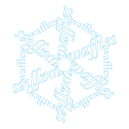
Notice what’s happening with the “ffl” in “waffles” That’s a typographic ligature, where two or more consecutive letters are joined, a legacy of manuscript writing that carried over into movable type but largely disappeared with computer typography. (Although it was computer typography that rescued the ligature from total exile by typewriters.) Here are a few examples of letter pairs and even a triple, with and without ligatures, in Adobe Caslon Pro.
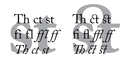
In some, but not all, cases, ligatures save space. Some pass easily and naturally by the eye, like Th and fi, and others like ct are more ostentatiously decorative. Note the interesting differences in the roman and italic forms of ct and st above. I enjoy these eccentric systems and their obscurely logical rules. I’m working on a version of the limeduck header with a spurious ligature, maybe on the ed. We’ll see how that goes.
Want (too much) more information? Start with i love typography on Decline and Fall of the Ligature and Blogdorf on ligatures. Wikipedia’s entry is good for tripping the TMI wire. Fonts with more ligatures than average – sometimes a lot more – include Adobe Caslon Pro, Mrs Eaves Ligatures, and Requiem by Hoefler & Frere-Jones, which includes the “dubious” ffffl. Now that’s superffffluous.
UPDATES 2/12:
Once you start thinking ligature, you see them everywhere. Check out k. d. lang’s new album, Watershed, with its trippy mirror type with ligatures, currently being flogged at Starbucks. I’m not sure I’ve ever seen an “ate” ligature before, but it looks nice and natural.
No good deed goes unpunished. I got a nice note from Jonathan Hoefler with a copy of Requiem attached. Hit refresh until you see the new header graphic I made using that font, which can only be called, Requiem for a Duck, featuring a nice ck ligature. Thanks again, Jonathan!
Trackbacks/Pingbacks