No, really, who has got buttons? I was shopping for mobile phones and since the last time I did so, maybe a year ago, it’s like the industry has declared war on actual, real, physical, clicky, buttons. What’s up with that? I’m not talking about keyboards. I’m talking about function buttons for stuff that, you know, you want to do quickly, maybe without even having to look at the screen.
I think every phone has some kind of wake/sleep/on/off kind of button and a rocker or pair of buttons for volume. After that, physical buttons get scarce. Except for the iPhone most have gone with capacitive “buttons” little patches of touchscreen with little or no tactile identity, and some of which, annoyingly, only light up and reveal their function when you touch them.
For clean design and let’s face it, cost control and durability, you want the fewest physical switches you can get away with. So what’s critical? In my view, what critical for a physical button is whatever you want to be able to do quickly or without looking at the phone – either stuff you might do while on a call (does anybody still do that?) or stuff you want to do fast. Here’s my list:
– STFU button: because you need a way to make your phone stop making noise as fast as possible. A volume down button that you keep jabbing while your inappropriate ringtone ruins your best friend’s wedding is just not fast enough. This should be a mute button plain and simple. All sounds and vibration off at one press. I think the iPhone has this next to the (two!) volume buttons. I usually set my phone to use vibrate for all alerts rather than play a sound, but there always seems to be some app that wants to make a noise at the wrong time.
– Snapshot button: because when your baby/pet/sunset/accident/celebrity sighting/wardrobe malfunction moment happens, you need to snap it quickly. I’d prefer this button to turn on the phone in camera mode and immediately take a shot. Most camera buttons I’ve seen put you into camera mode if your phone is already on and unlocked, and also work as a shutter button once you’re there. Not fast enough, I say. They’re just starting to get acceptably quick shutter lag, but that’s no help if it takes two taps and a swipe just to be able to start shooting. My now retired HTC Glacier / MyTouch had a camera button, but you still had to turn press the power button to wake the phone up and swipe to unlock it before you could even try to take a shot. My new HTC One lets you get to the camer with a single swipe from the lock screen, but again, you have to press the wake up button and once in camera mode you have to hit the shutter.
That’s it, just two buttons that I wish my phone had that I could find in the dark or in a pocket or without looking, and access immediately without going through menus or steps. Also nice to have but really I could live without if there was a reasonable way to do it in the software: volume controls and wake/sleep. In the why bother column, though I have to say they were useful for figuring out which end of the phone was up, home, back, windows, genius, whatever those three lines mean, etc.
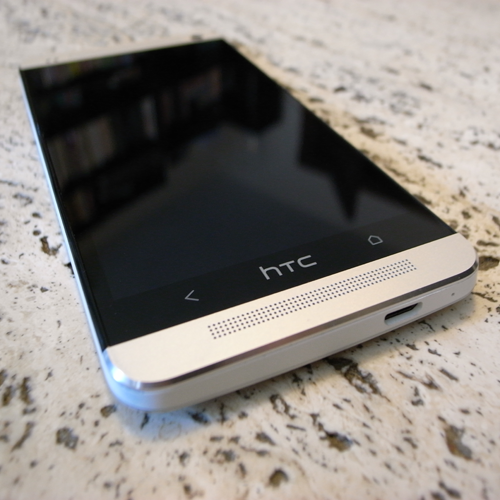
After some research, I figured out that I couldn’t have my chosen buttons, at least not on the set of phones I was considering. I chose the HTC One because T-Mobile offered me a free car dock with it. This device has just two (arguably three) buttons: a barely raised black rectangle on the top left of the phone that turns it on and off and wakes it up and puts it to sleep, and a rocker switch for volume control on the right edge. If you grab your phone with your left hand, you can hit the power button with your thumb and the volume with your index finger. With your right hand, the opposite. Either way, you’re then going to have to use your other hand or your dextrous thumb to do stuff on the phone. I’d argue that it’s almost unavoidably a two-handed job given the size of the phone. At the bottom of the phone (by the way, I haven’t yet figured out how to tell top from bottom without looking at it, and even then the power button on top looks a lot like the micro-usb port on the bottom) the HTC logo looks like a button but does nothing. To its left is the back “button” and to its right the home “button” – while you can see which is which on sight even unlit, neither one (or the HTC logo for that matter) has any feel other than smooth glass.
Maybe I’ll get used to this as I got used to on-screen keyboards, largely due to good software engineering (swype), but for now it feels like the smooth monolith of design has bulldozed this monkey’s pattern of tool usage.


