Mere minutes after I posted the roundup of globe stuff, I began to receive synchronicitous map-related items. Here are two that are interesting in juxtaposition.
First up: Microsoft makes their point with maps.
I was reading the deadly boring tech journals at work, as much for the ads as for the articles, and I found this two-page spread (inside front cover no less!) in Redmond Channel Partner from Microsoft hawking their partner program. (Note that at the time of writing, the RCP website is covered with banner ads echoing this print ad) Being who I am, I ignored the copy and squinted at the map backdrop and tried to figure out where it was. Can you tell?
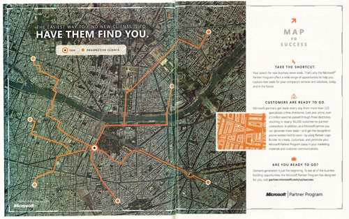
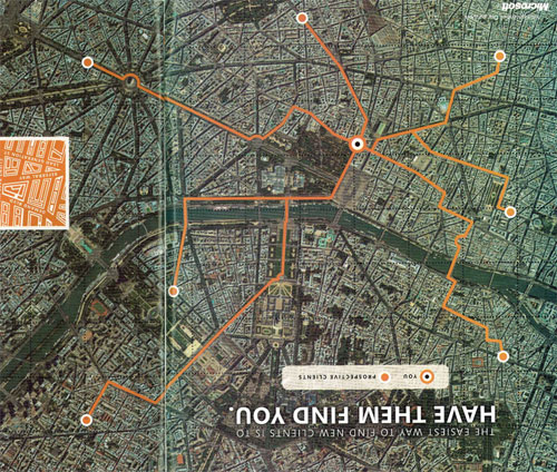
I guessed Paris just from a gut feeling and the general layout of the streets and the shape of the river. Not that I know Paris so well, but it turns out I was right. Probably some leftover memory of that class I audited in Course XI. You can see the Eiffel Tower to the right of the fold just above the river. But wait, the map is upside down – South is up, North is down – just like those snarky maps from Australia.
Here’s the ad in a more conventional orientation:
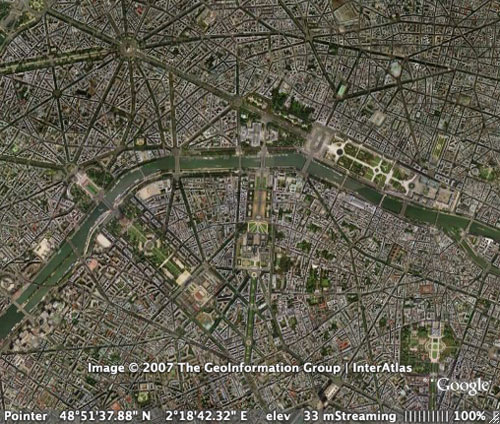
And here’s the equivalent from Google Earth (of course, MSFT wouldn’t use the same satellite data as arch-rival GOOG)
Going to the Microsoft Channel Partner Program site – partner.microsoft.com/us/success if you must – there are more map-themed graphics, mostly on a subway system theme, but there is a little re-use of the Paris map.
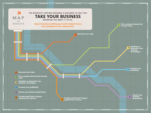

I was going to speculate at length about why they chose Paris and why they inverted the map (and possibly why they didn’t invert it in the little orange bit above) but I think it’s more profitable to discuss why the map meme is so common and so powerful in advertising. I think there are three good reasons:
1. Maps are common and well-understood
Advertising has to find an easy and well-traveled path into the brains of its audience. For most people, maps are a part of everyday life, and are generally considered helpful and useful things. Even if you can’t read a particular map, you know that it’s a map.
2. Maps are visually interesting
Maybe this one applies more to me than to the average person, but hey, it’s my blog. Maps are interesting. Many maps have color schemes or symbolic or numeric systems embedded in them, with or without a key. They contain lots of information, and the closer you look at them, the more information they deliver.
3. Maps are authoritative
Maps carry a built-in authority. Like a bar chart on the cover of USA Today, a map suggest that there’s actual data and information behind it. Its very presence suggests that objective truth exists and can be had by studying the map.
And that, if anybody out there is still awake and paying attention, provides a good transition to the second bit of map stuff that fell into my lap this week:
Part II: Radical Cartography
I got a message, on my high school alumni mailing list of all things, about an exhibition and book called An Atlas of Radical Cartography, featuring among others, fellow alum Lize Mogel. This is clearly the next step in my journey from collecting Strange Maps to mashing up with LOLMaps to a deeper level of critical analysis of the making and meaning of maps. My three reasons why maps are good for advertising (commonality, visual interest, authority) are exactly what makes Radical Cartography interesting.
Let me be clear that the following excerpts, unlike those above, are shameless plugs to encourage all readers to view, support and/or buy this work
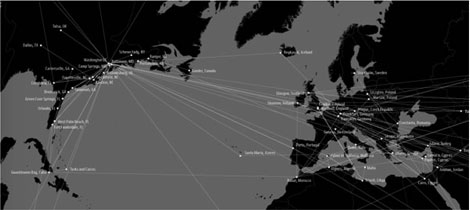
Map: Trevor Paglen & John Emerson “CIA Rendition Flights, 2001-2006”
Essay: Conversation between Trevor Paglen and Naeem Mohaiemen/Visible Collective
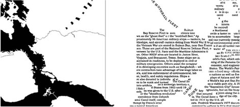
Map: Lize Mogel “From North to South”
Essay: Sarah Lewison “Our World is Changing, Soon Yours Will Be Too”
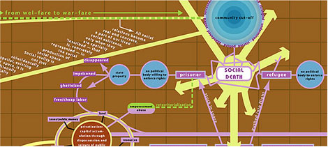
Map: Ashley Hunt, “A World Map in Which ”
Essay: Avery Gordon, “A World Map ”
Paglen & Emerson’s map takes the most literal geography and overlays political information on it. The map remains more or less literally accurate, although the choices of framing, orientation, projection and color cannot be purely aesthetic. In Mogel’s work, the literal outlines of places are still present but they have been mixed and rearranged to bring her political point into focus, while causing considerable figure-ground confusion, at least in me. And finally, in the Hunt map, things are completely schematic, with arrows and grid and labels only faintly suggesting conventional map-making. This one turns its point on poetry, a mod color scheme, and references to boardgames and powerpoint.
I ‘m looking forward to getting my hands on this book.

Is strangemap you?
Nope, I don’t know who runs it, but whoever that is, s/he is pretty cool by me.