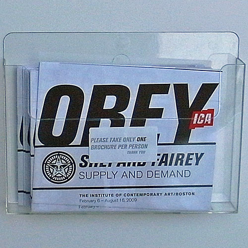
Despite Professor M calling Shepherd Fairey some bad names, or perhaps because of it, I ventured to the ICA again this weekend. Adjectival museum buddy L joined me. I went prepared to really love or hate the work, but ended up feeling left a little cold by it, and instead all fired up about the way the museum put it on.
The wall text and publicity around this show has been breathless to the point of annoyance with none of the ironic flair of the “OBEY” campaign or even the authoritarian exhortations of the socialist posters Fairey appropriates. The precious brochure opens with “How to go from arty prankster to worldwide cultural phenomenon (without losing the rebellious spirit that started it all)”

One of the first quotes on the wall text is Andy Warhol, “Art is what you can get away with.” That should pretty much sum things up. Whatever you think if Fairey, I can’t blame him for lapping up every bit of PR he can get and for pursuing or accepting this and any other shows that might present themselves. I think he’s a skilled graphic artist although I find his political statements pretty bland and obvious so far, but I certainly admire his record of getting his images posted in odd and interesting places, whether he does this himself or it’s done by his posse.
And whatever you think of the ICA, they sure look like blockbuster-seeking trend-followers for mounting this show. Maybe if they had included Fairey in a show before his Obama poster made it big, things might have looked a little different. But it’s the same Shepherd Fairey before or after HOPE.
Either way, in my opinion, somebody – the artist or the museum or somebody – has missed a major trick in mounting this exhibition. The exhaustive, almost exhausting, exhibition displayed almost exclusively fresh, clean, perfect silkscreens, prints and even paintings, framed, glazed and cleanly arranged on pristine white gallery walls. I don’t mean to ghettoize Fairey and say he can only do stencils and paste-ups, but isn’t that part of what’s interesting about his work? Why frame a picture by a street artist when you can paste it right up on the gallery wall, or better yet, show it pasted up on a real wall in the real world? To be fair, there was a large montage of photos of Fairey’s work in-situ, and a display case of some actual stencils, silkscreens and even a pair of paint-covered sneakers, but that was a fraction of the totality of the show.
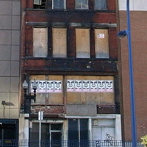
Wouldn’t showing this work be an opportunity for the museum to allow the artist to infiltrate the space, pasting his work directly on the walls, stickering museum signage, maybe even invading the other galleries and spaces of the museum? Sure, there’s a giant Andre sticker on the side of the museum, but it’s preciously placed and small relative to the space available. By comparison, look at this installation near South Station that I spied on the walk back.

Or this little treasure I spotted in a corner of the ICA’s railing – is it part of the museum’s holdings, or a guerrilla installation? I have no idea, but finding an OBEY sticker in a spot like this would not have been out of place. For the record, you can buy a pack of Obey Giant stickers for $10 in the ICA shop. Perhaps I should have done so and applied them directly the museum itself.

In some large-format works, Fairey worked in collage, using newsprint and other patterns as texture or background underneath the primary imagery, but those felt like contrived version of the effect you get when stenciling or postering over existing texts or textures. I have to think that the art-school Fairey (and maybe even the current one) would find this artificial and suffocating, perhaps in need of being stickered or stenciled over itself.
For those – like me – who know little of Fairey’s work beyond Obey Giant and Obama Hope, there was a little more worth seeing here: posters using a diversity of poster styles and influences beyond the socialist look, and a range of real and imaginary subjects covering musicians as much as politicians. I laughed out loud on arriving at Obey Flavor Flav although I was rather more engaged by Obey Chuck D.
Around that time, a man walked through the gallery carrying his toddler daughter on his shoulders. She pointed at something and squealed, “daddy, what’s that picture?” He looked up and said, “that’s the exit sign sweetie, it tells us where to go.” Indeed.
So, in summary, I give Shepherd Fairey high marks for self-promotion and middling marks for art, but I give the ICA F+ for imagination. In the lobby there were two Boston Phoenix boxes covered with Fairey stickers. On closer examination, I noted that they were covered with nothing but Fairey stickers and that the stickers left the Boston Phoenix logos exposed. The Boston Phoenix is a media sponsor of this exhibition and the boxes were not street art brought into the gallery but rather simple advertisements.
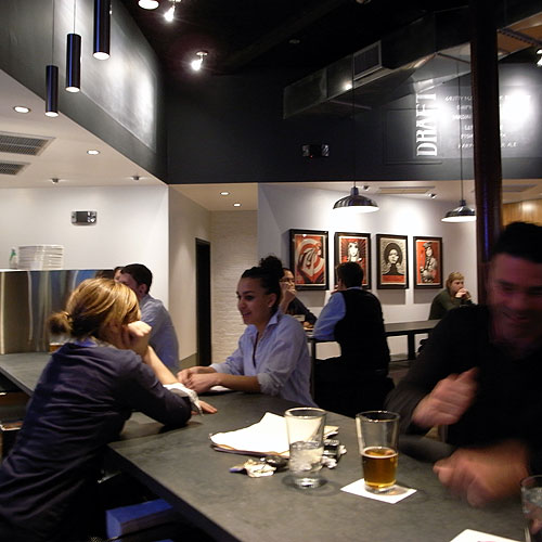
As if you needed more Shepherd Fairey news, I have to point out this item from Big Red & Shiny, wherein we learn that the Assistant DA attempting to prosecute Fairey moonlights as a bartender at a new & trendy Tory Row which is decorated with artwork by none other than Shep himself. Look for a review of their pizza on Grow Cook Eat soon.

PS the other work at the ICA – photos in Momentum 13 by Eileen Quinlan and the group show of video work called Acting Out – are both well worth a look and might be blogged in the future.

This is not the best medium for discussion but there is certainly more to the art and the artist. I have known him since we were both in college. He use to print work for the design shop I worked for back in the day. Today’s art world is a far cry from what they teach people in art history and what art was. Today you deal with brands, marketing, products even just the “artist” themselves can all be painted with the label of being “art”.
You get what you want out of it in the end I think. If you like it, you like it and you try to get some of your own or you hate it and move on. A multi-million dollar diamond skull? A 60 foot sheet of rusted metal? A boy with a pipe? Hand painted Dunny?
Anyone doing Rococo anymore? 😉