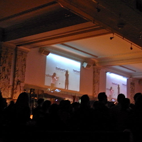
 Some time last year, I first learned about Pecha Kucha from the estimable Presentation Zen blog, but it wasn’t until last night that I experienced it. Pecha Kucha, in a nutshell, is when people get together and share 20-slide presentations in which the slides advance automatically every 20 seconds, for a crisp 6:40 each. The content of the presentations isn’t specified, only how they are delivered.
It’s generally done as a forum to practice the skill of making and delivering presentations, of focusing ideas and images into a predetermined format. It’s become a world-wide movement, and the Boston chapter’s sixth Pecha Kucha night was last night at Mantra on Temple Place. I dragged former colleague and fellow design geek J to the festivities.
The evening was co-sponsored by AIGA, “the professional association for design,” and many AIGA members were in attendance and some presented.

I love the idea of Pecha Kucha. Creative people getting together and playing a sort of party game. People getting serious about the craft of presentation. Using arbitrary constraints to flex your brain and create something, like writing haiku or sonnets. I didn’t fully know what to expect, and I was surprised on a few counts.
First, 20 seconds can be a long time, and so can 6:40. At work, I used to budget about a minute per slide. I now budget less because I’ve gotten better about reducing the amount of information on each slide, but now I have more slides. At Pecha Kucha, I often found myself impatient for the slide to advance. Similarly, at work, I’d be thrilled if any presentation lasted only six or seven minutes, but again, some Pecha Kucha presos seemed to drag on.
Second, having every slide up for the same amount of time is strange. Imagine a film in which every cut or scene was the same length, or a book with every chapter exactly the same size. I hadn’t given much conscious thought to the rhythm of a presentation, but it’s a powerful thing.
Third, these design types don’t just use fewer words per slide, they use none. I’m a big fan of words and also of typography, so this threw me for a loop. Sure, eveybody spoke to their slides, some at great length, but in most cases I felt a little lost when there was no verbal matter on screen.
It was too dark to take notes or decent photos, but some of the presentations that stood out where those by Chris Pullman of WGBH, Denise Korn of Korn Design, and Lisa Williams of Placeblogger.
Pullman was the lead off presenter and his talk was a capsule history of WGBH’s new building and the giant video screen thereon. His timing on the 20-second transitions was impressive, and as you migth expect of somebody working in TV or radio, he told a story with a beginning, a middle and an end.

Denise Korn presented another story, this one about a summer intership program she launched called Youth Design Boston. Showing images almost entirely of the teens in the program and their work, Korn played perfectly to the audience of design professionals, most of whom were probably told as youths, as J put it, “you’ll never make any money drawing!”
She mentioned that one YDB project is a redesign of the MBTA’s Charlie Card being pitched to the mayor’s office. I’m glad I’m not the only one who finds that Charlie character a bit creepy and maybe not the only who who feels some nostalgia for the colorful and ever-changing oldstyle magnetic strip MBTA fare cards.
Finally, I have to mention Lisa Williams’ presentation, a pitch of sorts for her company placeblogger. Honestly, I was expecting more like this – a mix of text and image in the service of pitching a company. But around the third slide, Williams declared that the slides had been rearranged out of order and the rest of the presentation was a bit of live improv or a game of battledecks.
Some of the other presentations were more like narrated slideshows of the presenter’s work or work he liked, and a couple were downright bad, with bad timing, monotone script-reading and overfull slides. On the other hand, the better presenters told engaging or even inspiring stories despite the restrictions of the format.
I’m very glad I went. I think I learned a couple of things that might be useful in my own presenting, and oddly, I find myself itching to try for a slot in a future Pecha Kucha night. Presentation topic ideas, anybody?
