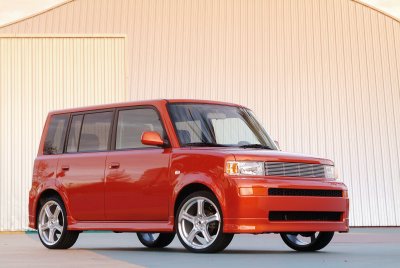
Americans seem to like to define themselves by their cars. I like to resist that, but I do appreciate good design, and I do recognize that an item as large and visible as a car can’t help but contribute to your personal brand. For what it’s worth, this (not the precise example in this photo, but very close) is my car: a 2004 Scion xB in the “release series” limited edition (#1394 of 2100) color called “hot lava.” It’s square and it’s hip. And orange.

Or it was hip. This summer, Scion redesigned the xB and the 2008 model looks like this:

Overnight, I’m no longer so hip and my car is suddenly exceptionally square.

It’s still hip and cool, not square, just boxy. LKB
I dunno, Leslie, the new Scion xB … fails for me. The old one was so ugly it was stylish, like granny glasses. The new one is just stodgy. Glad David has the older orange model.
What I want is a Scion xB hybrid …
I get asked if the car is a hybrid occasionally. I think it just looks so odd, people figure it’s odd on the inside too. I did a little more research, and I realize that the redesign is far more dramatic than rounding some corners – the 2008 xB is 600 pounds heavier than the 04-07, as well as a whole foot longer and 3″ wider. The engine is 2.4 liters, up from 1.5. The whole thing is based on the Toyota Corolla platform now, as opposed to the smaller and lighter Echo. I bought the 04 xB in part for the small size and fuel economy, so this version would probably not make my consideration list. Read more on the xB in Wikipedia and the SF Chronicle.
Ennis, I think I was misunderstood or I misrepresented myself. I meant to say by “it’s” is his original car, that is still hip. I agree, David’s is much better looking and much cooler than the new one.