I finally addressed a shameful gap in my Boston art-peeping by visiting the ICA’s (not so) new South Boston space with intrepid museum buddy L. We had heard from some that the architecture was better than any of the art contained inside, but we found things to like both inside and out.
The Institute of Contemporary Art Boston moved from the Back Bay to South Boston with much fanfare and a fancy new building with a harbor view. We took the Silver line (it’s a bus, get over it) to the Courthouse station and followed the signs. Approaching the building from the land side, it looked disappointingly small and uninteresting, but walking around to the harbor side, we found a deep patio with amphitheater-like steps climbing up from it. The building’s cantilevered fourth floor framed the scene interestingly.

Inside, we paid $12 each and took a glass elevator almost the size of my apartment to the fourth floor where all the galleries are. On view was the special exhibition by Anish Kapoor, a group show called Street Level, a solo show by Nicholas Hlobo, and some work from the permanent collection. I’ll just write about the first two for now, but you should check out the whole museum.
Street Level is composed of work by three artists – Mark Bradford, William Cordova and Robin Rhode – who use the themes and visual vocabulary of the urban street in their work. “Using metropolitan grids, billboards, boom boxes, and graffiti as open-ended metaphors, their works both celebrate and critique how cultural territory is defined and transformed in urban environments.”
Bradford uses the visual language of maps (always a favorite here at the ‘duck) and the materials of discarded and destroyed urban advertising to make wall-sized compositions describing mysterious urban topologies.

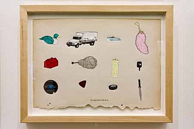
William Cordova, "World-Famo Paintings" (detail), 2004–2005. 100 framed drawings on found paper with ink, graphite, collage on paper, masking tape, and framed book. (ICA photo)
Cordova uses a repetitive set of symbols, like an urban tarot deck, to meditate on urban cultures. His series of 100 small drawings, “World-Famo Paintings” literally rips pages from the art history book and remakes them with his imagery. I didn’t necessarily get the joke without the help of the wall text, but I’m totally taken in by his draftsmanship and symbolic language.
Rhode’s work in video and stills in series work around themes of time and space, using simple chalk or charcoal drawings to create live-action stop-motion animation in a weird but effective combination of two and three (and four) dimensionality. Don’t miss his “half-pipe” where he rides a real skateboard up and down a chalk half-pipe drawn on the street.
Anish Kapoor is a well-known sculptor based in England, presenting his first US retrospective in many years. The dozen-plus pieces span over 20 years of his career. Most of the recent work had intriguing visual and even sonic properties that made them engaging and interactive.
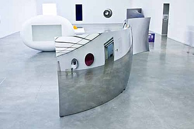
The closer you get to pieces like “Brandy Wine” (the dark red round thing visible reflected in the center of the installation view) the more they pull you in. At one or two yards, the shiny surface starts to flip between concave and convex as your brain struggles to process the information your eyes are sending. If start to talk, you hear your voice reflected oddly, concentrated by the dish shape but also amplified. It operates almost like a whispering spot, and people across the room in certain places can hear you clearly.
Similar visual effects happen as you approach “My body your body,” “Marsupial” and “Untitled” (the white ovoid with the rectangle) as the simplicity of the forms and their large scale take up more and more of your field of view, there are fewer and fewer spatial cues.
The large mirrored S-curve in the middle of the gallery is alike a slice peeled from Kapoor’s Cloud Gate (often called “the bean”) in Chicago, and has similar crowd-pleasing funhouse mirror properties. It’s very disappointing that gallery staff were working hard to prevent anyone touching these sculptures. Cloud Gate is out in public, subject to weather and countless tourists greasy mitts, and seems no worse for wear. Certainly some of the work is fragile or even dangerous or dirty to touch, but wouldn’t it be more successful if it were constructed with the possibility of touch in mind?
Moving on to my favorite piece, one that I definitely didn’t want to touch, with the same name as the exhibition: Past, Present, Future. You’ve probably seen pictures of this thing, but believe me, you have to be in its presence to really get it. It’s a huge quarter sphere coated in a thick layer of tinted Vaseline. When you get close to it, you can smell it, and you can hear a low rumbling. After a few minutes, it becomes clear that the steel slab embedded in the goop is in fact a huge wiper arm, slowly moving across the surface, smoothing out the material as it goes. You can get a better idea of all this, including the sounds, from this WBUR piece. We asked an attendant how long it takes to make a complete cycle, and more importantly, what happens when it gets to the end?
The ICA people said it takes about 90 minutes to make a sweep, so we did some quick calculations and resolved to return closer to the moment of truth. I’m not sure how many visitors even notice that the piece is moving, and how many of those are such nerds as to make an appointment to see the end of the sweep.
Our nerdliness was rewarded. I won’t tell you exactly what happens, because I want you to experience it for yourself, but I will say that you should be very quiet, because the sound it makes is wonderful and horrible at the same time. Disappointingly, the sweep doesn’t carry all the way to the wall, apparently due to some suction-related wall damage at prior installations. We also learned that when the show is done, the installation team will scoop up the Vaseline and pack it back into drums for shipment to the next home of the work. Wow.
In closing, I want to call your attention to an amazing space at the ICA that might be overlooked: the Poss Family Mediatheque, an educational space with raked seating and computers. What makes this space interesting is that there’s an angled window at the end/bottom of it, and from certain vantage points, all you can see out the window is quietly rippling water. The whole room feels like its slowly moving through space. I wasn’t able to snap a picture and there’s none on the website that adequately explains this. So go see it unless you’re prone to seasickness.


Hey thanks for the link love.
That pic of reporter Andrea Shea in hazmat suit is a hoot!
its too bad that the reviewer of the Street Level exhibition could only assume that the “world famo” piece was a “joke” and dismiss the artists work there after. It is also interesting to read how the review really “liked” only works that didn’t make you think or required any type of interpretation rather Anish Kapoors installation which can be spoken about for its color and form. Robin Rhodes work was embraced very well by the writer because he was performing and for his audience. Providing entertainment for the consumer and requiring no further or deeper thought.
Hey Sandy: I am the “reviewer” here also known as the “author” of this “blog.” I write about stuff that I “like” and sometimes “dislike.” Grow an apostrophe and tell our readers more about what you thought about the work at the ICA. -David