Have you noticed that just about every computer or TV screen has gone widescreen? I’m not sure what portion of TV programming or movies comes in what aspect ratio, but I’m definitely seeing computer monitors expanding horizontally.
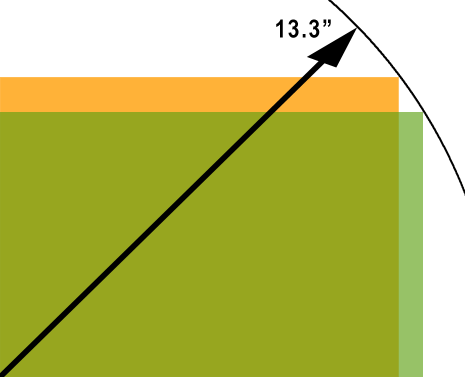
There are some good reasons for wider screens – such as looking at two full pages of a document or watching a widescreen movie – but I have to suspect part of this fad is actually fed by the monitor manufacturers giving us less and marketing it as more. Why? Because we measure monitors by their diagonals, and you can deliver less total screen on the same diagonal if you go wider.
For example, the popular MacBook has a 13.3″ diagonal screen with a resolution of 1280×800, from which we can calculate an aspect ratio of 1.6:1. This means the screen is 11.28 x 7.05inches for a total screen area of 79.50 square inches. An old style 4:3 (1.33:1) screen with a 13.3″ diagonal would be about 10.64 x 7.98, or 84.91 square inches. This means that Apple and other laptop makers who go wide are delivering 6.4% less screen and positioning it as the same or better.

Sinister plot or giving the consumers what they desire? I’m not sure. The most screen you could get on a given diagonal would be square, and that doesn’t seem attractive or practical for a laptop. As a reader and occasional creator of web pages, I feel like we’re too willing to go wide at the expense of the height or length of a page. Scrolling down is one of the enemies of good web usability, and more and more sites seem to float in wide margins to the right and left.

Late-breaking stats from one not so random website show this distribution of screen aspect ratios reported by visitors yesterday:
1.33:1 45% (37% is 1024×768)
1.6:1 30% (20% is 1280×800)
1.25:1 21% (all is 1280×1024)
others 4% (range from super wide, probably double-monitor setups of 2.67 or 2.5:1 all the way down to some kind of mobile device at 320×396 or about 0.8:1)